I wanted to follow up on our post from last week that aimed to put the market impact of Coronavirus in perspective. In that post, I talked about how markets and investors have reacted to different recent health crises in the past.
Since then, I’ve come across a few resources that I think help put all the chaos from the last two weeks into perspective.
Below is a graph that does an excellent job of illustrating how markets have behaved over the lifecycle of various epidemics in the past:
Growth of $1.00 during Various Outbreaks

Chart source: Avantis. Data source: Robert Shiller Data Collection at Yale University and Centers for Disease Control and Prevention (CDC). S&P 500®Composite Index does not include reinvested dividends.
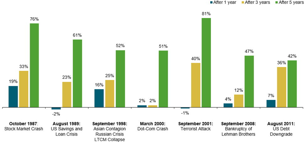
In that same vein, this second chart illustrates the returns we’ve seen following various crises that have triggered volatility in equity markets. What we see historically, is that markets often show strength over the long-term, following periods of great uncertainty. If our perspective on markets is long-term, we’ve been able to participate in that growth.
Performance of 60% Equity / 40% Fixed Income Portfolio, Cumulative Total Return

Source: Dimensional. In US dollars. Represents cumulative total returns of a balanced strategy invested on the first day of the following calendar month of the event noted. Balanced Strategy: 12% S&P 500 Index, 12% Dimensional US Large Cap Value Index, 6% Dow Jones US Select REIT Index, 6% Dimensional International Value Index, 6% Dimensional US Small Cap Index, 6% Dimensional US Small Cap Value Index, 3% Dimensional International Small Cap Index, 3% Dimensional International Small Cap Value Index, 2.4% Dimensional Emerging Markets Small Index, 1.8% Dimensional Emerging Markets Value Index, 1.8% Dimensional Emerging Markets Index, 10% Bloomberg Barclays Treasury Bond Index 1-5 Years, 10% FTSE World Government Bond Index 1-5 Years (hedged), 10% FTSE World Government Bond Index 1-3 Years (hedged), 10% ICE BofA 1-Year US Treasury Note Index. Assumes monthly rebalancing. For illustrative purposes only. S&P and Dow Jones data © 2019 S&P Dow Jones Indices LLC, a division of S&P Global. All rights reserved. ICE BofA index data © 2019 ICE Data Indices, LLC. FTSE fixed income indices © 2019 FTSE Fixed Income LLC. All rights reserved. Bloomberg Barclays data provided by Bloomberg. Dimensional indices use CRSP and Compustat data.
To be clear, this gives us no assurance that this is what returns will look like in five years. We have no idea what markets are going to look like in five years. It’s certainly possible that equity returns could be negative on a five-year basis.
But, the weighted evidence of history gives us confidence that equity markets can continue to work for most investors in accordance with a well-designed investment portfolio.
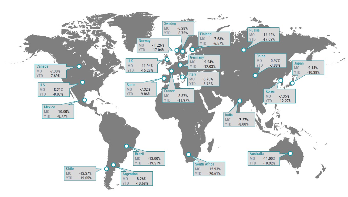
Markets often behave in ways that run counter to what intuition might suggest. For example, did you know that China, the country from where all this originated, currently has one of the strongest performing equity markets in 2020?
Equity Returns by Country

Chart source: Avantis. Data compiled from FactSet. Data as of 2/29/2020. Countries are represented by MSCI country indices. Performance in USD. Past performance is no guarantee of future results.
Markets rarely work in an “If A, then B” manner. That’s why forecasts and market timing strategies seem to fall short so often.
We do not use forecasting to shape our investment decisions. In fact, we lampoon the forecasters pretty regularly, so this shouldn’t be news to anyone. But, just for a moment I want to highlight an observation about the forecasting business.
Do you know how many 2020 market forecasts included predictions or impact of Coronavirus (or a pandemic, in general)? Exactly zero. We’re two months into the year and it’s clear that the energy spent on predicting what’s in store for markets in 2020 is already worthless.
The things that seem to really make an impact on markets are unknowable ahead of time.
If you feel uneasy about sticking with your investments during times of volatility and potential loss, that is normal! Believe it or not, we feel the same unease when markets show downside. As advisors, we’re not immune to fear, either.
But, we rely on the same research and perspective that we provide to our clients to ease those worries. If you feel an impulse to flee your investments, first ask yourself the following questions:
When we build client portfolios, they are built with the expectation – no, the inevitability – of negative events just like this occurring. It’s already baked into the formula.
Home prices can bounce around much the same way the stock market does. Of course, unless you’re tracking the daily price movements on Zillow, you may not realize it.
When your home value falls 5% or 10% in value, no one goes “Oh my goodness, should I sell my house before it falls more?” No. It’s your home. There’s a good chance you plan to continue living in it for a while.
Why should the attitude toward an investment portfolio designed for retirement be any different? You need a home to live in, long-term, the same way you need the growth and income of an investment portfolio to keep pace with inflation and provide for your needs and goals, long-term.
You can control how much bad news you consume on television. You can control how often you wash your hands. You can control how often you touch your face (well, I can’t, but hopefully you can do better). Spend this weekend focusing on the things your can control instead of worrying over the things you cannot.
If you’re looking for a wealth manager and financial advisor that puts you first, call Ferguson-Johnson Wealth Management today!
CONTACT US